
Story Contributed by Aarti Sharma
In this feature, #20 of the ‘Riverside 40 Years, 40 Stories’ series, we’re sharing the story of the BIA’s brand evolution! The brand has evolved greatly over 40 years thanks to the bold ideas of Board members, Marketing Committee members, and innovative graphic designers. Today, the Riverside BIA’s award-winning brand is on full display throughout the neighbourhood. Read on to learn the story and see examples of the brand over time…
The vibrant pole banners and pole wraps along Toronto’s Queen Street East from the Queen Street Viaduct to Empire Avenue can’t be missed – the hot pink, purple and blue hues are sure to catch your attention while passing through the Riverside BIA.
Since 2018, these striking colours have become an indispensable part of the Riverside BIA’s brand. This was the year when the BIA thoughtfully invested in re-branding with the Riverside Board of Management and Marketing Committee and designer George Conidis of geocdesign.com. From then on the brand was built and fused into the BIA’s identity online and on the street, giving it a striking new makeover.
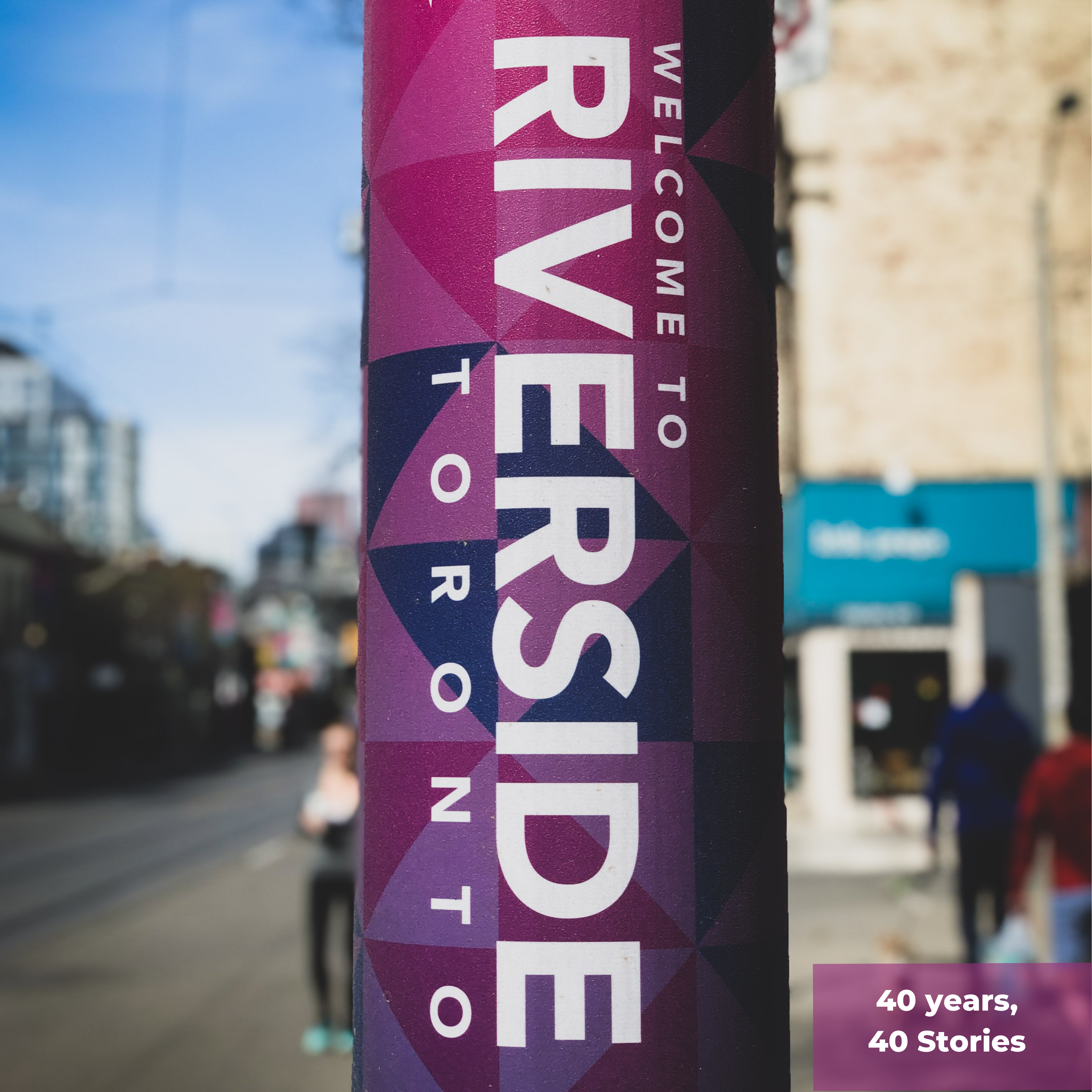
Riverside BIA current vibrant branding, thanks to the Riverside Marketing Committee and graphic designer geocdesign.com
But this followed a long tale of evolution of branding which is equally fascinating. It all began with Queen-Broadview Village….
Early BIA Branding
Riverside BIA began as ‘Queen-Broadview Village BIA’ in 1980. Then BIA founders including Albert Edelstein proudly displayed the BIA brand via street banners, planters and BIA swag as seen in the images below. The brand emphasized the close-knit community feel of the BIA as a collection of main street businesses working together toward a common goal of marketing and beautify the business district:
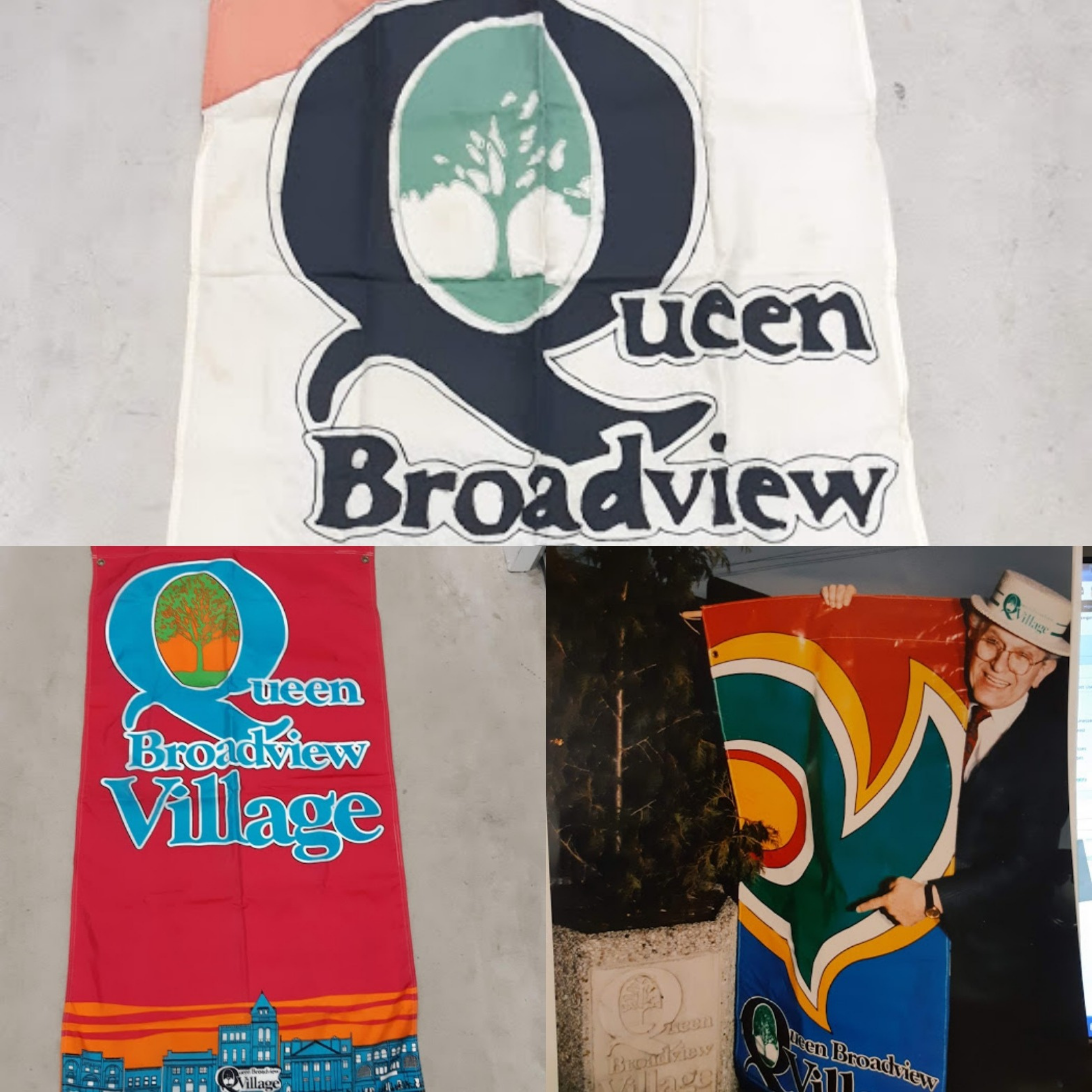
Examples of branding of the Queen-Broadview Village BIA (now Riverside BIA) from the 1980s and 90s
In the early 2000s a renaming effort got underway to bring the BIA to a name that reflected the neighbourhood original roots as ‘Riverside’ since the 1880s. In 2004, the name ‘Riverside’ was officially adopted as the BIA’s new identity. The branding came to reflect the connection to the Riverside with a water theme and the idea of being ‘Toronto’s Authentic Urban Neigbourhood’ with its focus on small businesses, community, sustainability, and public art and culture – as illustrated by the example below of a Riverside BIA banner illustration by Toronto artist Jessie Durham:
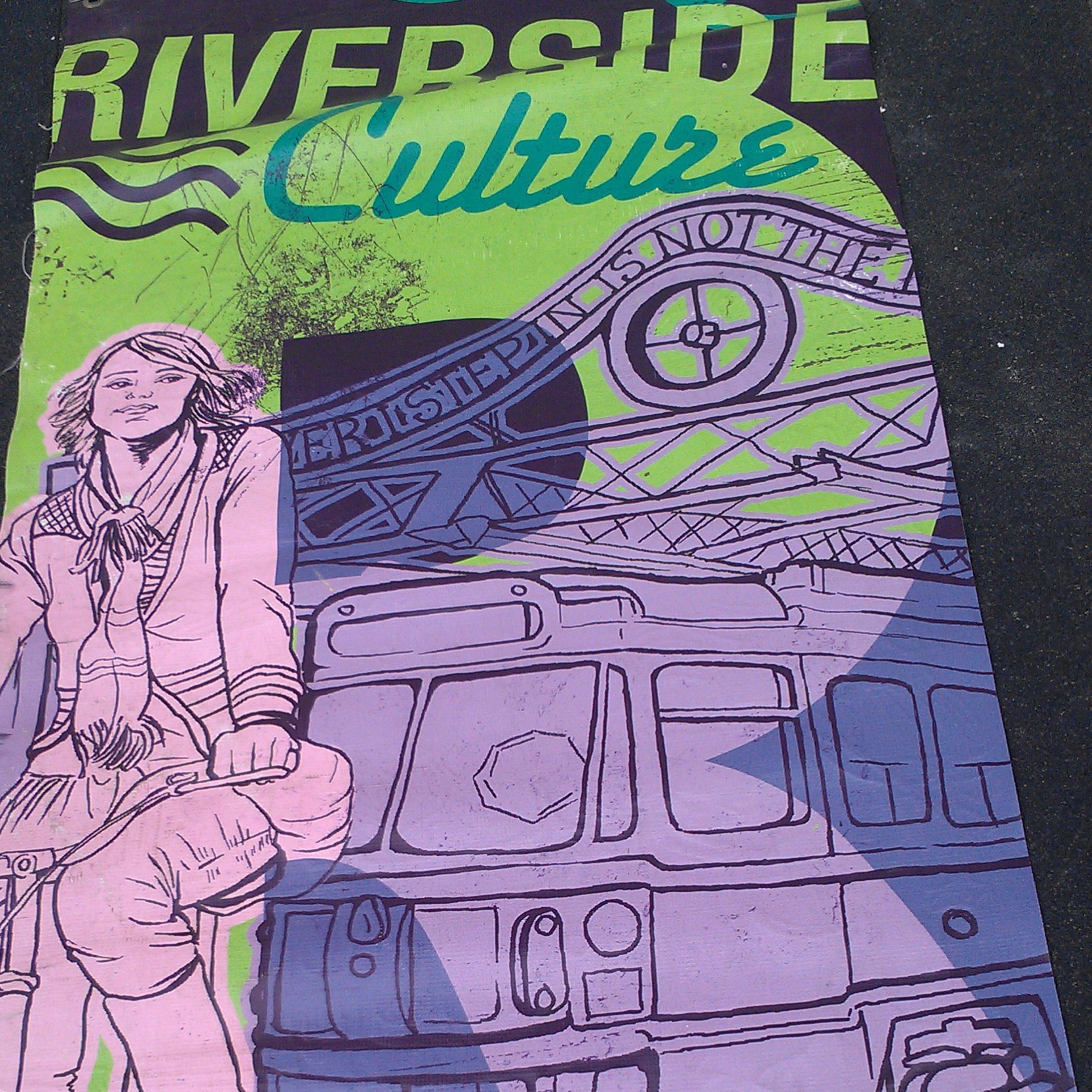
Branding of BIA once it has been renamed to Riverside BIA in the 2000s – illustration by artist Jessie Durham
Why the 2018 re-branding?
By 2017, the Riverside BIA had developed a robust schedule of annual public programming and community events, and the area had attracted a diversity of vibrant community-oriented businesses to call Riverside their home. The persona of Riverside BIA had changed into a go-to, lively and compelling neighbourhood with a lot to offer.
The Riverside BIA Board, Marketing Committee and designer George Conidis of GEOCDESIGN wanted to introduce that same vibrancy and life to the area’s brand, along with a cohesion online and on the streets. Coupled with new creative technologies such as branded poles wraps, the BIA invested in website changes, street banner and poles wraps, TTC ads, and decals and more.
The re-branding journey…
George recalls his discussion with the Riverside BIA team: “The guidepost for this mission was clear. Community has always been at the core of Riverside, and the ambiance and the feel it offers were the compasses that steered all of our branding discussions.”
George followed the ideology ‘Simple is more’ throughout the design process.
The archive of images of all the Riverside events over the years, gave the design team an overview the past design and branding. This helped in considering each element that would go into the new design.
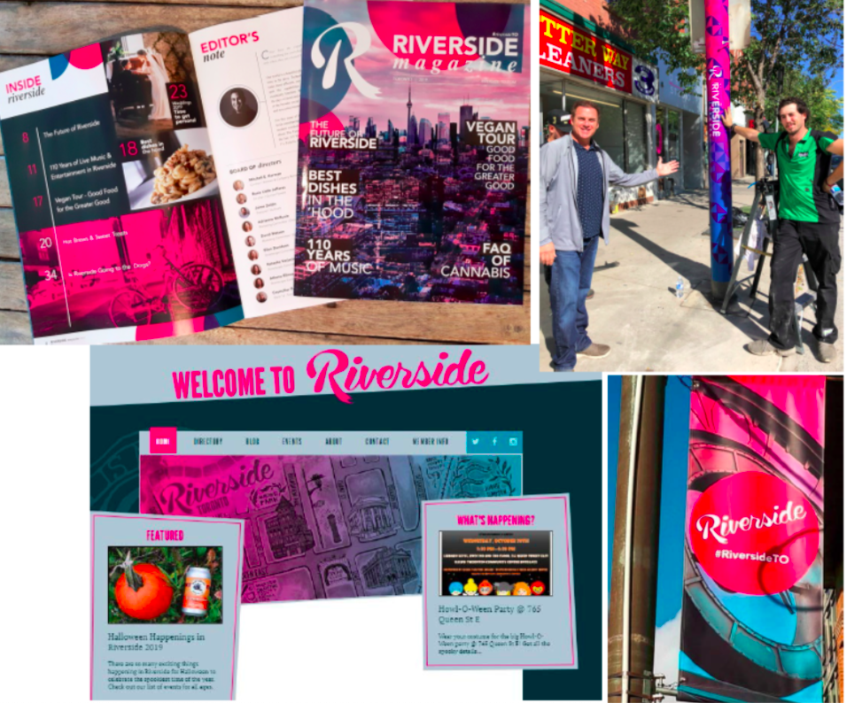
A look at Riverside BIA’s re-branding work over 2018-19
Color Palette
George brought forward the creative vision of splashing the Riverside brand with the bold and beautiful hues of hot pink, purple and blue; thus bringing character to the brand that palpably brought out the personality of Riverside.
This versatile palette was chosen to work well in all seasons, from spring to winter. These colours were weaved into Riverside BIA logo, marketing collaterals (posters, pole banners, pole wraps, Riverside magazine, TTC shelter, postcards, and visiting cards), Riverside icon, and the website.
Riverside’s New Brand Becomes Award-Winning
In 2019, Riverside BIA’s new brand was recognized by the Toronto Association of BIAs (TABIA) and awarded the ‘Branding Award’.
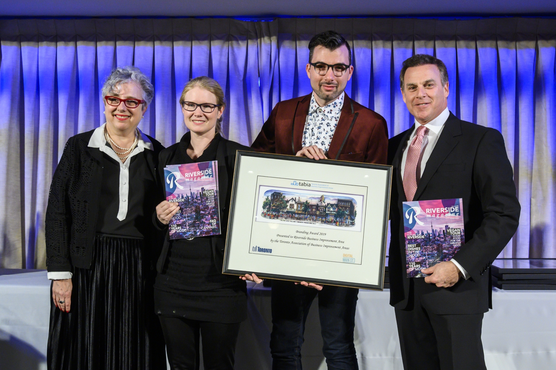
Riverside BIA Won TABIA 2019 Branding Award (Left to Right: TABIA Chair; Jennifer Lay of Riverside BIA; Geo Conidis, Graphic Designer for Riverside; BIA Co-Chair Mitch Korman)
George and the Riverside team have given this modern flair to the Riverside brand thus breathing a new life and character into the neighbourhood; while the old emotion of being community focused is distinctly reflected as the focal point.
This passion for the neighbourhood will always get the spotlight in the Riverside brand even as it continues to evolve!

The ‘Riverside BIA 40 Years, 40 Stories’ Series is part of how we’re celebrating the 40th anniversary of this incredible neighbourhood of community-builders.